Rebranding The Auntie Bulletin


"Make it look like a pack of children’s markers, please."
Today’s post is a little different from our typical content, aunties, but I’ve been slowly working toward a newsletter rebrand since the fall, and it’s finally time, and I’m really excited about it. I’m sharing my reflections on the process because figuring out how to graphically represent auntiehood often poses interesting challenges. (Thanks to my buddy Eleanor, of the excellent, paywall-free thrifted style newsletter Rabbit Fur Coat, for encouraging me to do this post and helping me think it through).[[1]]
Today’s post will be a treat for the design and process aficionados, but if that’s not you, rest assured that next week we’ll return to our regularly scheduled Auntie Bulletin programming.
And now a couple of newsletter business pre-things before we get to the main thing.
I’ve stopped capitalizing “auntie.” Is this bad? Do we hate this decision? When I started this newsletter, I made the casual decision to capitalize “Auntie” for the sake of role legitimation. I felt like we needed more recognition, more street cred, and I figured maybe the capital “A” would communicate importance. Yet as this newsletter’s reach grows, it’s become unwieldy to use non-standard capitalization. (We don’t capitalize “mother” or “step-mom” or “basketball coach”) you know? I’m hoping we aunties (and this newsletter, and my work generally) will increasingly be featured in media outlets that have actual editorial guidelines, so the switch from “Auntie” to “auntie” is about standardizing usage across platforms.
The Auntie Bulletin is now here on Ghost instead of Substack, optionally. Substack will stay our primary home for now, because Substack still has the best growth engine of any platform and in order to earn a livelihood, I need this newsletter to grow. On the other hand, Substack is funded by venture capital and is therefore undergoing a process of enshittification. In February, Substack announced a despicable partnership with a gambling company. Substack also (still) willingly platforms Nazis and Andrew Tate. So I’ve been losing paid subscribers due to readers leaving the platform in protest.
With the help of my wise and clever buddy Emmy Singer, I’m trying a new experiment, which is to parallel post all Auntie Bulletin newsletters here on Ghost. I opted for Ghost because it’s open source and funded entirely by users, and I’m hoping when the (likely) day comes that I have to leave Substack, Ghost will make a good landing spot.
Here on Ghost, you’ll still receive weekly posts in your inbox, but they’ll arrive a few days later. Paid subscribers making the switch will need to cancel their subscriptions in Substack (if you have an annual sub, message me and I’ll refund you the pro-rated amount), then go get a new subscription over at Ghost.
I’m not sure what might go wrong as we spin up the Ghost version of The Auntie Bulletin. If you encounter an obstacle, I’d be so grateful if you’d let me know (auntiebulletin at gmail dot com).
Now Let’s Get To It
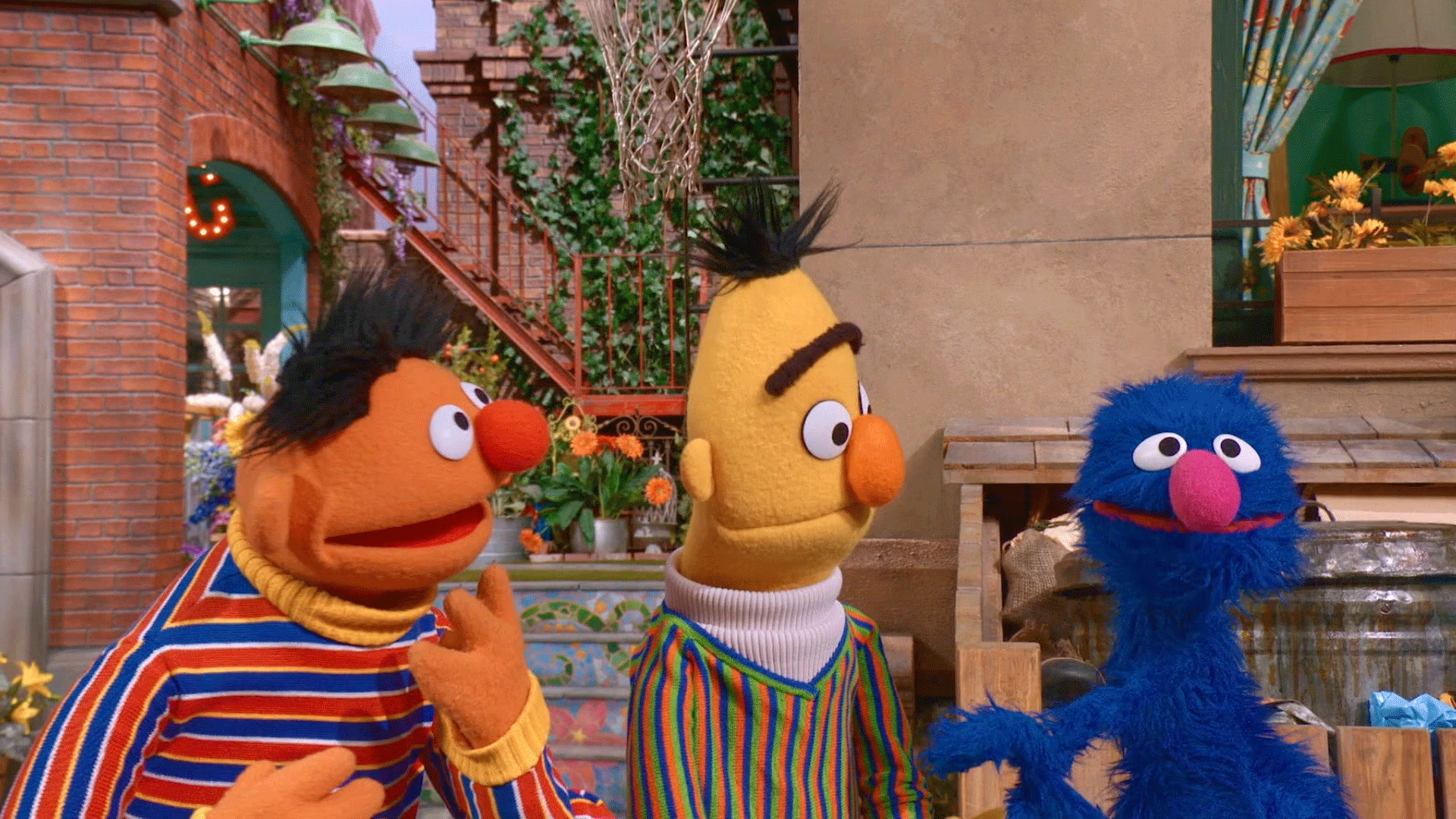
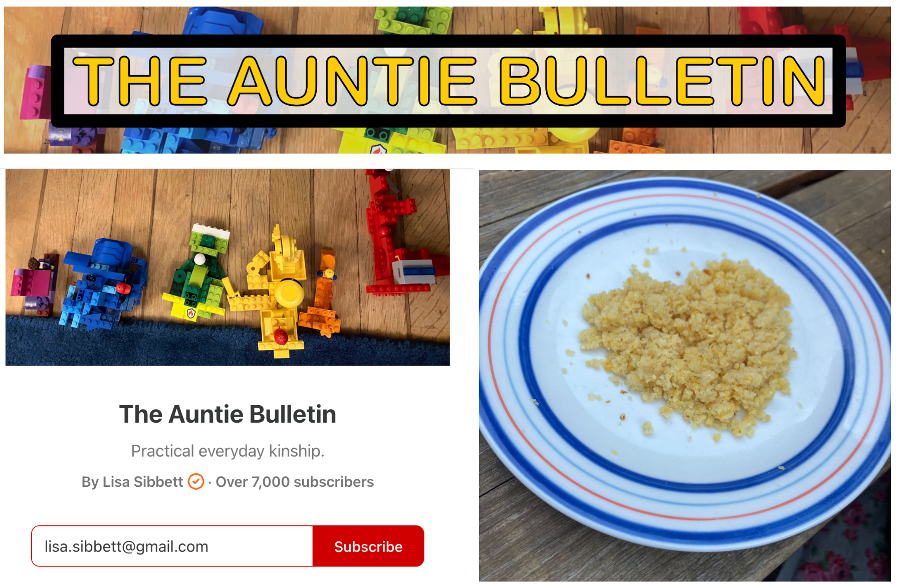
I’ve always been a primary colors person. I’ve been wishing literally since childhood for a shirt with stripes like Ernie’s from Sesame Street’s Bert and Ernie. So I knew the look I was going for when I started The Auntie Bulletin: colorful, playful, gender neutral, unsentimental. I chose a few anchor images from my photo roll and created our logo myself using a random photo editing software that offered a 14-day free trial.[[2]] I liked the scrappy DIY assets I created at the time, and I still like them today.
However, this past fall I decided to rebrand and create a more visually unified look that I might use to promote my newsletter beyond Substack – meaning 😬on social media.
Now, I have only ever had Facebook, and I stopped Facebooking over a decade ago. I created an Instagram account once in the late aughts but then never used it, and a few years later a colleague at an academic conference convinced me to start a Twitter account, but it made me instantly anxious so I never used that either. I have never downloaded TikTok. I have loved not being on social media. (Although Substack Notes basically is social media, so I guess I’m back on social media already now).
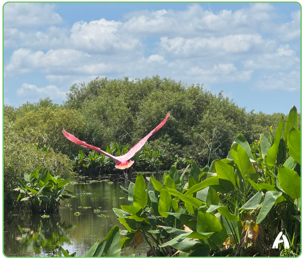
Anyway I saw this thing last fall that was like, “You can get lots of new subscribers by promoting your newsletter on Pinterest!” and I was like, “well, that’s not really social media, so maybe I can stomach it,” and then I started thinking I’d need more whaddayacallems – assets to make carousels (???) and then I tried to figure out how to DIY something using the free version of Canva. In particular, I wanted a way to visually tie images together. Since I don’t use photos of other people’s children, I wind up using a lot of artwork in the public domain — from places like the National Gallery, the Metropolitan Museum of Art, or the Library of Congress — and that’s cool (according to me), but it’s not visually consistent. I was like, “okay, I need to figure out way to make my images seem like part of one thing, and then choose a font and some branding colors…” but that all wound up being difficult and confusing and that’s when I realized I should hire someone who knows what they’re doing.
I then put out a call to the Auntie Collective in search of graphic designers and got a much larger, swifter response than I’d expected. So many lovely, creative people read this newsletter! Fifteen or twenty people reached out, but the very first one was Sriparna Ghosh of Tiffinbox, and she’s who I wound up hiring (along with her partner, Rohit Chaudhary). This turned out to be an excellent choice.
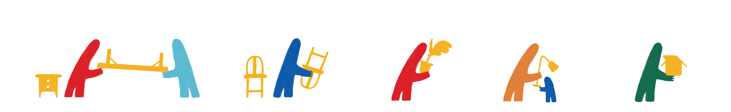
Below the paywall, I explain how I wound up choosing this design team from among so many great options, then I describe the process of arriving at our new Auntie Bulletin rebrand (which includes a bunch of adorable-ass story strips like the one below). I’ll also be offering you a small gift, which now comes free with a paid Auntie Bulletin subscription: a colorful, printable PDF of the New Baby Bill of Rights (a post many readers appreciated). Then, at the end of this post, I want your advice on the final logo. I need to choose between color options and I could use your opinion.